Thursday, 30 November 2017

Employing a photographer for The Prawn Shop

Due to the growing sales and online attention my clothing brand The Prawn Shop is receiving i contacted a photographer i know and explained how i would like to have some more professional photos taken for my website and promotional material rather than the images i currently use where the clothing has been photographed on a wall in my bedroom. Not very professional but still attracting customers. 

Earlier this month i set up a meeting with the photographer, we discussed my ideas for the shoot such as the lighting, the props and how many models i would be using. I thought it would be appropriate to have one model per t-shirt/jumper the design; to promote the brands ethos of body acceptance, equality and diversity. There are 16 designs on the Prawn Shop website and so i created posters and hung them around the university asking for volunteers to model, many people replied and after sorting through the applicants i recruited 16 people to model. 

Opposite is the contact i provided for the photographer. 
Studio A in the photography department was booked out by the photographer for two studio sessions, the first taking place onTuesday the 28th and the second taking place on Monday the 4th of December. 
In preparation for the shoot i spent two days painting a backdrop, the backdrop is a light pink bed sheet which i painted imagery similar to the images on the clothing on to with red acrylic. 


On the day of the shoot more props were collected; a large plant taken from the photography studio and a flat chair type cushion for the backdrop to be laid upon for the models to be sat on and a dark red bean bag. 


Both shoots went really well, it was interesting to see how important very aspect of the shoot is, such as the lighting; using red gels over the lights to give a pink hue, making sure the props are positioned the same in each shot and having continuity within each models individual shoot; we ensured this by looking back at the images and trying to have each model do similar poses. 

The models all came with different clothing for me to style; to ensure i was projecting the right look alongside the clothing i designed. 

I am currently waiting on receiving back the shots from the photographer, he is going to select the best shots from each models shoot; ensuring that there are at least 5 images per design as specified within the brief. 
I'm really excited to see the finished shots, the website is going really going to push the brand i believe and make it in to a more professional clothing brand rather than just a small business one. 
After i get the shots back i am going to make look-books which i will then send out to magazines and clothing labels which i like in the hope that i perhaps get a response or even a work opportunities. 


Sunday, 22 October 2017

Manifesto

From my exploration in to my own personal aims as a designer over summer, I want to take this year as an opportunity to really see how far I could go in terms of combining graphic design and fashion. 
To improve I’d like to discover how to get my brand out there more, I feel as if I’m relying on social media for sales and customers, and although there’s nothing wrong with this and they’ve got my brand known to the point where I walk around Leeds and I see people wearing my t-shirts, I want to see if there’s another way, a more professional and more collaborative way of showcasing my brand.

Wednesday, 11 October 2017

SUMMER

During my time away from university over summer, i developed my own clothing brand The Prawn Shop. 

Last years PPP module got me thinking about what career i would ideally like to go in to, during a presentation i presented to the course i expressed my interest in clothing and clothing design and it being something i would like to look more in to. 
With almost 3 months to my self i decided to turn my designs in to t-shirts and so www.theprawnshop.bigcartel.com was born. 


I sought out samples from various t-shirt printing manufacturers i found online, after 4 disappointing iron on type printing methods, i found Martin (or at least that's what he told me to call him) a seller on ebay.
I developed a working relationship with martin, who's based in London, over summer, discussing the printers he used, which colours would work best on which fabrics and over a few weeks, brought out my first two t-shirts on the 20th of June.
I posted the two designs on social media (twitter, instagram and facebook), my first tweet about the shop, which included images of the two tees currently available and a link to the shop has been viewed over 66,000 times in the 112 days The Prawn Shop has been live.

In the first day of sales i sold 33 t-shirts in 7 hours. From this came a following to the brands instagram account which now has over two thousand followers, along with this i developed loyal customers, some of whom have bought every t-shirt available on the website.

I'd tried to set up a brand similar to this last year however i got few sales, the problem i've identified with past ventures is the lack of focus within the designs. I researched my intended target audience of 16-25 year olds and developed a series of t-shirts with designs focusing on issues that matter to me and evidently issues that matter to other people.

The designs available on the prawn shop focus around sexism, misogyny, body confidence, sexuality and equality.
the first two Prawn Shop designs.

As the bands following increased there was what i felt to be a demand for more designs available, so with the rest of my summer i developed 9 new designs in a range of options including coloured t-shirts, jumpers, sweatshirts and more recently (using the printing facilities at university) prints!

By creating my own clothing brand in just over 2 months, i've sold over 400 products.
This summer has informed my career direction for the future, i know that fashion is something that i would love to pursue, in a way that combines social issues and design all in one, and from the way things are going, i don't see any reason why i can't achieve this.


Below are more examples of the designs available at the prawn shop, along with customer photos, including customers from the U.K, Berlin, Australia, Greece, USA, Spain, Poland and Germany. 


Wednesday, 29 March 2017

Girls Club Zine

The summer of 2016 i submitted a piece for a small publication called 'Girls Club' a zine celebrating and publishing art and designs by female creatives across the country. 


Yesterday i received an email saying how my design is going to be included in the 4th issue, available April 4th.

I'm really pleased about having some exposure of my work, I've also worked in collaboration with a journalist student in Manchester to create a zine focused around young emerging designers and artists. 

During this summer when i have time away from college i'm going to create and sell a zine of my own. 
Not only could this have the possibility of gaining exposure to my work but it will also act as a demonstration of my work at this current time, which i feel will be beneficial to the growth of my designs; being able to reflect on previous skills and approaches. 

Tuesday, 28 March 2017

Reflective Evalution

PPP has really engaged me throughout the course, it's provided me with time dedicated to thinking about what i want out of my life, acting as a point to gain inspiration and motivation. 
If i could change how i went about engaging with ppp it would be to take a risk, and use my time to find out about new methods and new designers who i enjoy so that i'm able to develop my work, but having said that i feel like ppp has made me confident with my current style, and has now engaged me and informed me to step it up and essentially create exciting work that is progressing from my current style, not changing. 

That's something I've learnt, that trying new methods of producing work is not creating a whole new style, rather it's developing your current style in to one which is evidently mine, but with an innovative, advanced touch to it. 

Inspo : Music


Inspo : Film


Design inspiration

Mangitt Happ - UK based illustrator

jordyn mcgeachin
Here i have began collating images that i have gained inspiration from within my current and upcoming design ideas.

New Orleans-based Instagrammer @joythebaker - Drake themed cakes.


Alice Bloomfield, Brighton based illustration student


Jeff Östberg


Design Strategy

The final presentation was titled 'Design Strategy' in which i presented what I've learnt this year upon reflecting, and examples of my work throughout the year. 

I went in to this presentation fairly confident, i felt like i knew what i was going to say, i knew the slides i will be presenting and my skills have increased and my nerves have decreased in terms of presenting in front of a class, however this presentation was perhaps my least successful out of the three I've done. 

Based on the feedback i received I feel that it was the content and the approach to the presentation which made it less successful. 
I took a hand drawn approach to the presentation slides, much like the previous presentation. However it was safe, and upon reflection quite predictable. The content i included in the presentation was good, i believe, the lack of imagery and exploration of different mediums is what set me back. 
Upon reflection it's becoming apparent that i need to advance my approach, i can't just continue illustrating the same lines in the same colours or else my work will be predictable. 


Inspiration: bryant giles

I first came across Bryant Giles' pieces on twitter which he frequently uses as a platform to showcase his work.

Above is his piece titled 'Migraine'. I really appreciate Giles' use of layering and the different mediums he uses throughout his work. Although he uses a vast majority of colours, materials and line qualities, the delicateness of the drawings along with the serious themes which run through them work really well together. 


Inspiration: Polly Nor

London based illustrator Polly Nor's illustrations of 'Devils and Women' have been a source of inspiration for me recently. 


The simple use of lines and flat colour work are effective and provide impact due to the subject matters of her pieces, which i believe to be lust, reality, sexuality, gender, mental health. 


The themes of Nor's pieces are what intrigues me the most, she has the ability to address serious issues in a way that could be interpreted in a number of ways, and softly at that, theirs no, i believe, forcefulness to Nor's work despite the theatrical recurring elements (devils). 


Wednesday, 22 March 2017

Self Branding

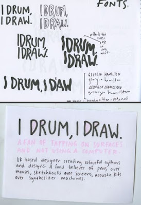
Devising self branding for my self wasn't as difficult as i thought. I know what materials i like to use, i know what work i produce, i know my style and i know who i am as a designer and person right now. 
I chose to reflect my main hobby; drumming, along with design, the two creative outlets in my life. 
Coming up with a colour scheme wasn't hard either, i want to have self branding which can be interchangeable and adapt depending on how i feel, always using bright colours but not limiting my self to one colour pallet from the beginning. 
I wanted to ensure my self branding reflects my hand drawn approach to graphic design and so all imagery and typography were hand drawn by me, to give more of a personal touch and true reflection of my practice.  


After having to give a brief presentation for the reflective practice A2 poster I was slightly more calm going in to the presentation. The presentation received good feedback, the design of the presentation was aiming to reflect who i am (at this moment in time) as a designer, staying true to the work i produce and i believe this concept was understood and appreciated. 
To improve for the next presentation i believe i can enter the situation more calm, speak more confidently, speak slower and remember to bring some water.  

reflective practice


For the reflective practice brief we were to create an A2 poster demonstrating what we've learnt over the course. 
I chose to approach this brief by hand as it's what i feel most comfortable in doing and what is most reflective of my self s a designer. 
Using A2 paper in a bright mango colour (i tend to use bright bold colours in my work) i sectioned off a smaller rectangle within the center to show how (reflecting back) i tend to give my self a smaller time limit to complete things in than originally set.

The poster is made up of hand drawn typography which is something i use across most of my work, presenting what i have learnt over the past months such as hands > mouse, waking up at 7am isn't fun and making shit work is also okay. 

The feedback the poster received was positive with comments that the style and hand drawn approach was something that i should carry on doing in my work as it gives it a point of difference.